Building a Hiking Tracks Map App - The LONG Version
Estimated reading: YONKS
I’m rebuilding my hiking tracks map that pulls in DOC tracks, huts, and alerts across Aotearoa New Zealand — applying what I’ve learned since first tackling it last year.
It’s on the longer side and not a page-turner, but the goal is to document the process and show my approach.
1. Backend Setup
19/07/2025
Starting with the more familiar tools, I set up a basic backend server using Express, keeping things split between index.js and server.js. Nodemon is running to handle auto-restarts while working locally, and I’m using dotenv for environment variables.
I’ve kept routes and controllers separate to make the code easier to manage as more endpoints are added. I tested a simple “hello world” route directly from the app file, and then again once I’d separated it out, just to avoid issues when setting up the database.
I used MongoDB as a quick way to get up and running. I find the Atlas methods pretty intuitive, and it’s been easier to test with compared to PostgreSQL. I set up the MongoDB client connection using the starter code, imported it into my controllers, and created controllers for POST, PATCH, DELETE, and GET for the ‘users’ collection. Routes were then put in place to handle those.
I also built controllers to pull in data directly from the DOC API covering tracks, huts, and alerts – with routes set up to handle those too.
To help with performance, especially when dealing with all tracks at once, I’ve added Redis caching. Previously, I’d tried caching locally but found it hard to improve load times. The getAllTracks controller now checks Redis before pulling from the API, speeding up repeated requests. The difference in response times changed from around 8 seconds to a few milliseconds, so I’m hoping this will help on the client side as well.
I tested all the endpoints through ThunderClient and was able to add, update, delete, and find users stored in MongoDB, as well as fetch tracks and huts from the DOC API. With that in place, step one’s done for now: data flowing from both MongoDB and the DOC API, with Redis managing cached responses.
2. Frontend Setup
20/07/2025
With the backend in place, I’ve now got the frontend up and running for the hiking tracks map.
I’m using React with Vite, TypeScript, and TailwindCSS. The setup was fairly straightforward and didn’t need much change from the starter files, apart from adding the Tailwind plugin and setting up the Vite config to handle API proxying to the backend. The layout is simple for now, just enough to test API calls and start building out the map.
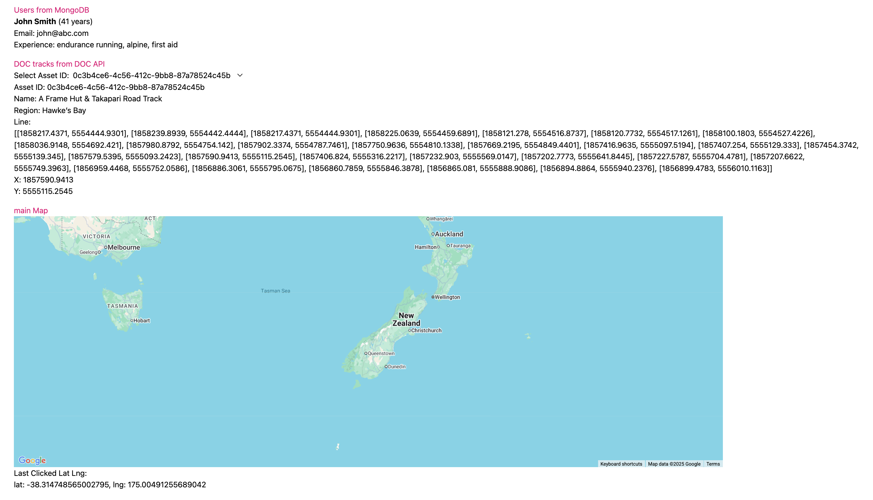
I created API files to handle the fetch requests for both the users data from MongoDB and the track data from the DOC API. These fetch functions are used inside individual TSX components, which each handle displaying their own data.
Those components are then used inside the main App component. Right now, I’m rendering a simple list of users and another for DOC tracks – mainly just to check that the data is coming through correctly from the backend.
or the map itself, I’m using @vis.gl/react-google-maps. I’ve got an onClick event in place which logs lat/lng coordinates when you click anywhere on the map. That’s mainly for testing, but it sets up the basics for adding markers and lines later.
At this point, the frontend is pulling live data from the backend, displaying users and tracks, and rendering the map. The next step will be focusing on getting the actual DOC tracks and huts onto the map itself.
3. Custom Markers and converting data
21/07/2025
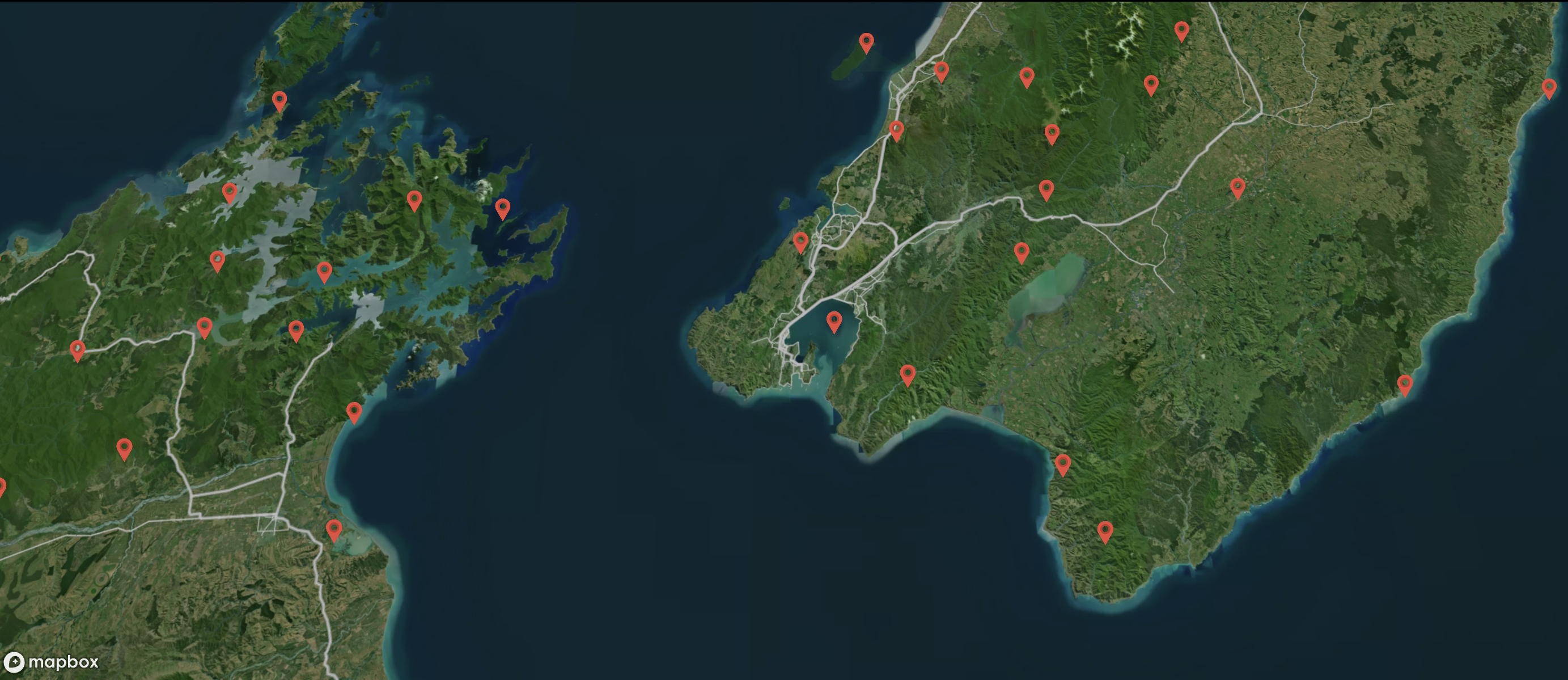
With the map rendering and track data coming through from the backend, the next step was getting markers onto the map to represent each track.
I wanted to display each DOC track as a marker using a custom SVG icon, rather than the standard Google Maps pin. To do this, I created a CustomMarker component that wraps the AdvancedMarker from @vis.gl/react-google-maps and places an SVG icon inside it.
The track data from the DOC API includes x and y coordinates for each track. Initially, I assumed these could be used directly as latitude and longitude, but looking again realised i'd need to convert first.This was because the coordinates are actually NZTM (New Zealand Transverse Mercator), not WGS84.
Searching for solutions, I came across this StackOverFlow post, where someone had a similar problem but using Python and the pyproj library. That pointed me in the right direction at least knowing the coordinates needed to be converted using a projection library.
I refactored their approach to use proj4js (the JavaScript equivalent of pyproj). I created a conversion function that transforms x/y NZTM coordinates into lat/lng, which I now use when plotting each track as a marker.
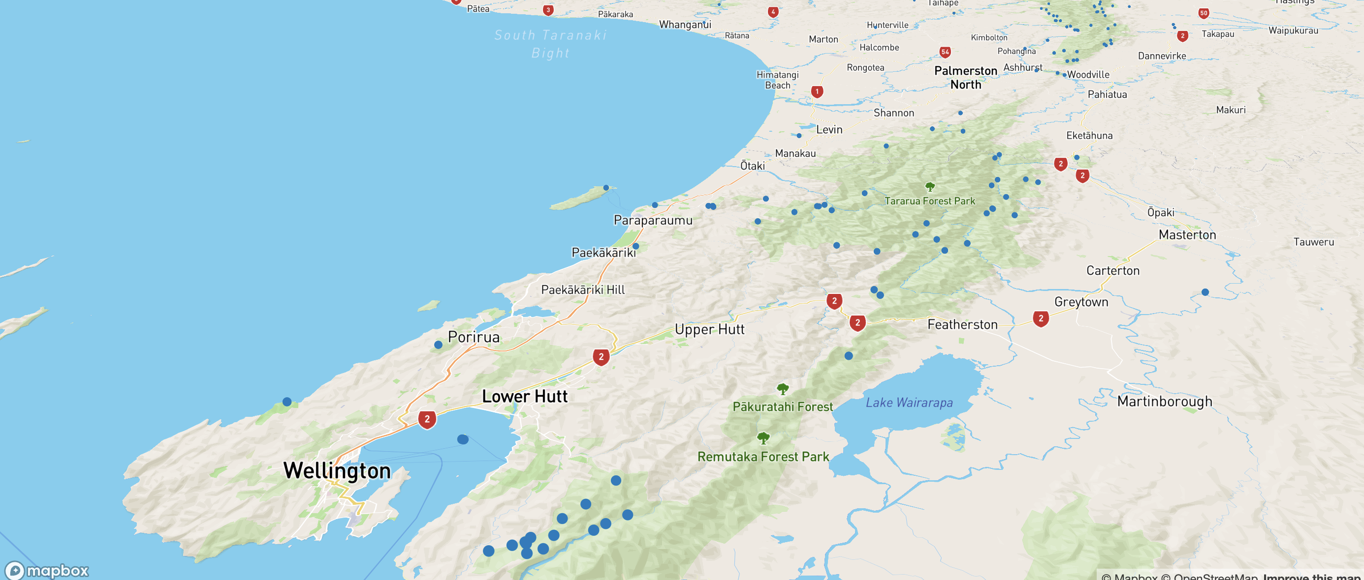
The frontend now fetches the track data, converts the coordinates, and displays each track as a custom SVG marker. I'll need to look at some kind of clustering to help with loading and to make the app more usable, especially with the need to add polylines and taking more screen space.
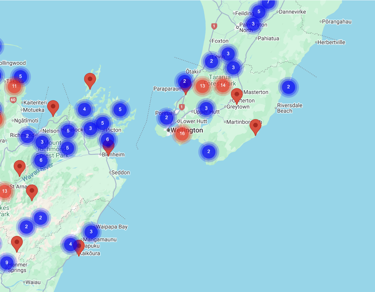
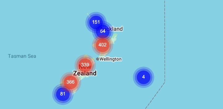
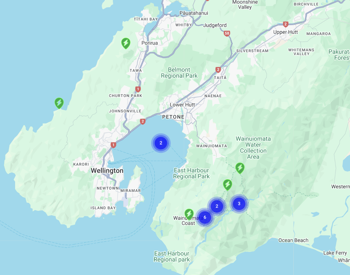
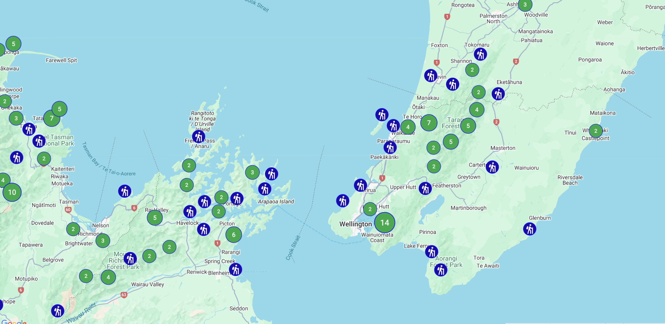
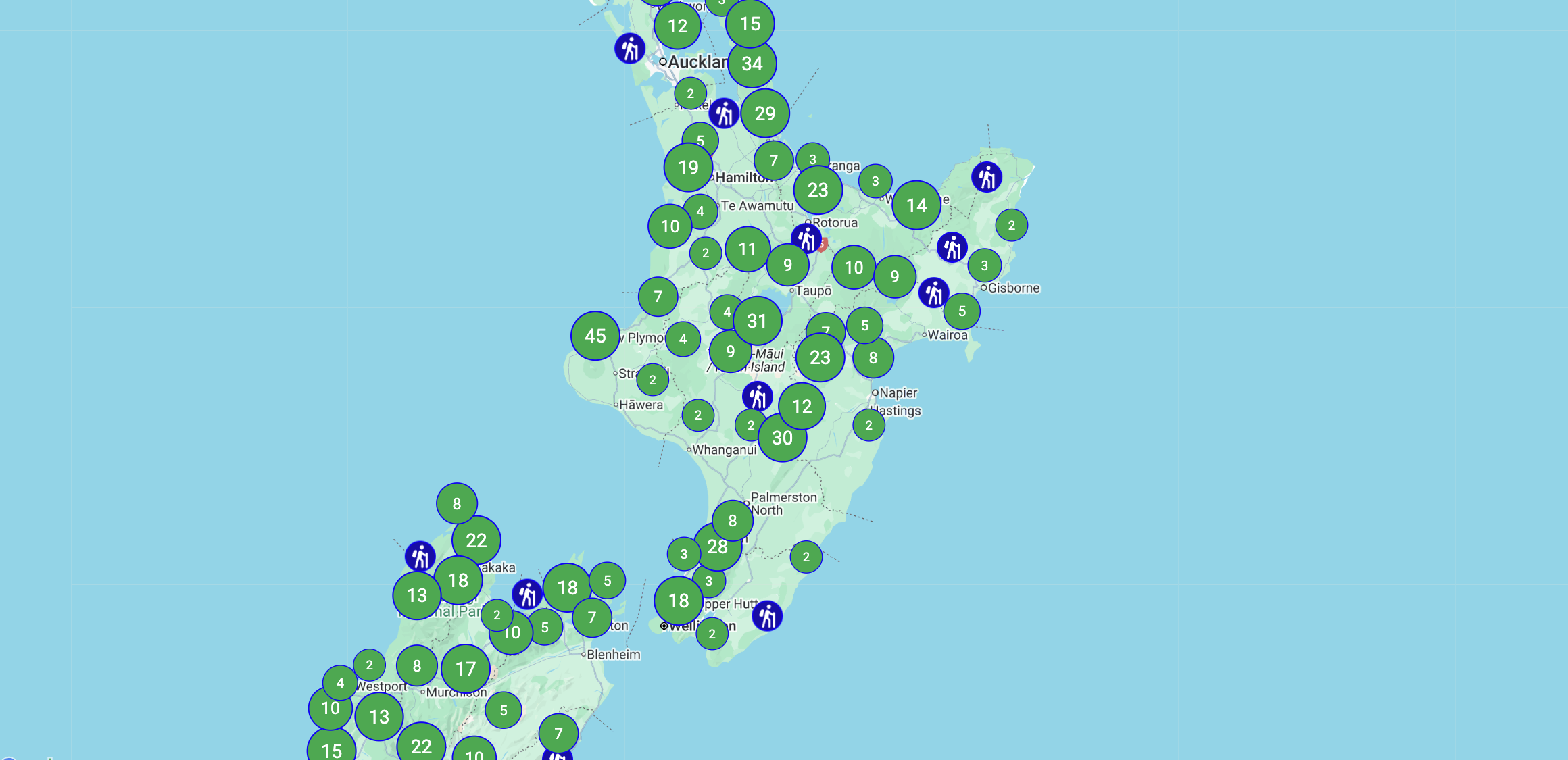
4. Clustering Map Markers
22/07/2025
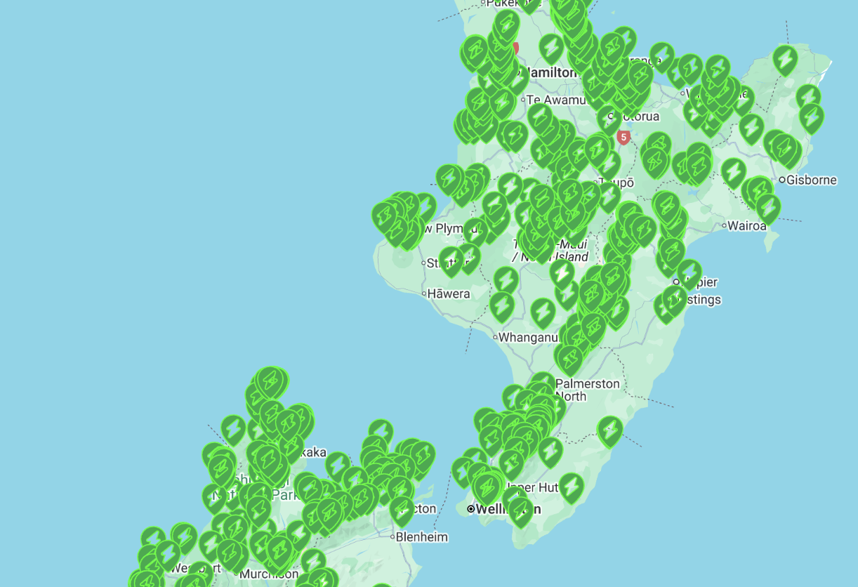
With how many tracks and huts showing, I knew clustering was a good next step, but wasn't sure of the best approach.
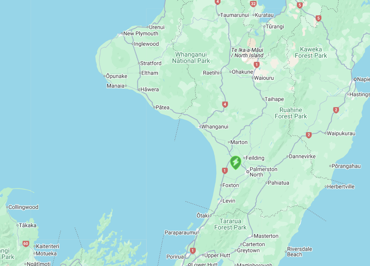
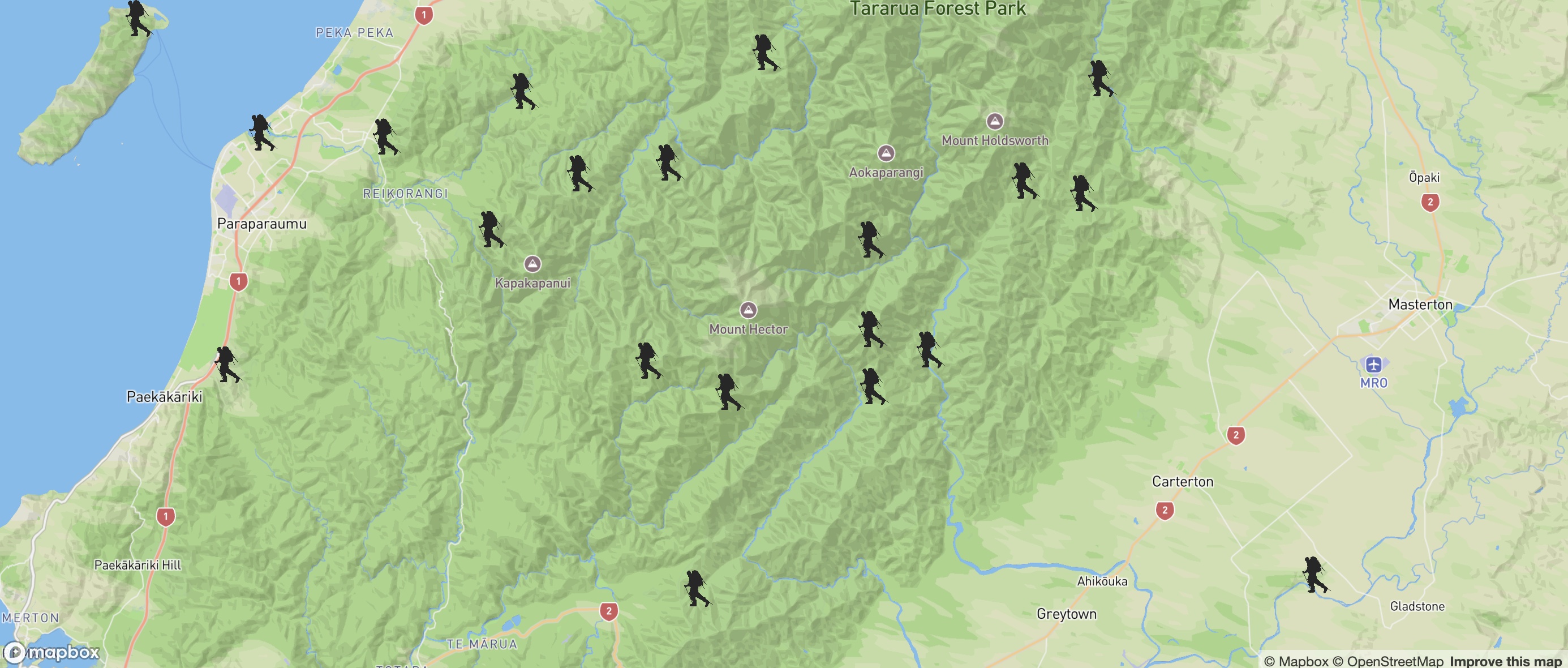
I considered using the googlemaps/markerclusterer package, but found it did not support my custom SVG markers, or the newer AdvancedMarkerElement (which I'm using via @vis.gl/react-google-maps). It only supported the deprecated native Google Maps Markers, which aren't being removed accoring to the warrning in my console, but still seemed bad to build with an end of life package. The image below is what it looked like before realising my mistake.
Supercluster was another option I was looking at. It seemed to support custom markers being added, but also requires loading an array of GeoJSON Feature objects with each feature being a Point geometry, like:
{
  "type": "Feature",
  "geometry": {
    "type": "Point",
    "coordinates": [lng, lat]
  },
  "properties": { ... }
}
This means I’d need to convert my existing track data from x/y NZTM coordinates into lat/lng, then wrap those coordinates in GeoJSON Point objects before loading them into supercluster.
Or I could implement **basic logic** by rendering individual markers only above a certain zoom level and Bbelow that zoom level, rendering a single regional marker. This lets me avoid converting to GeoJSON and keeps using my current data format and custom markers but would require manually defining regions or threshold logic, which could get complex, especially since DOC shows hundreds of traks and huts.
Skipping clusting was a thought too but based on the data size, it would be more useful to implement, versus say custom markers.
Further reading showed that AdvancedMarkerElement support was added in the official MarkerClusterer as of July 18th (just a few days before I wrote this). This now allows clustering using advanced markers directly without needing workarounds.
To use AdvancedMarkerElement with clustering, I’d need to import the Google Maps libraries, define my markers using the new AdvancedMarkerElement, and then cluster them as normal using MarkerClusterer. The Stater code from the Google Developer docs showed how this was done:
const markers = locations.map((position, i) => {
  const label = labels[i % labels.length];
  const pinGlyph = new google.maps.marker.PinElement({
    glyph: label,
    glyphColor: "white",
  });
  const marker = new google.maps.marker.AdvancedMarkerElement({
    position,
    content: pinGlyph.element,
  });

  return marker;
});
With the new updates, I was able to use my own custom svg using the modern Advanced Marker, within the official Google package.
Changed my SVG file to be a string rather than TSX component. Updated MainMap to show ClusteredMarkers component
With the latest updates, I was able to use my own custom SVG markers alongside the modern AdvancedMarkerElement, all clustered using the official Google Maps MarkerClusterer package.
I converted my SVG file into a plain string instead of a React component. This allowed me to inject the SVG directly using innerHTML when creating AdvancedMarkerElement markers.
I created a dedicated ClusteredMarkers component to fetch track data then create AdvancedMarkerElement markers manually and inject my custom SVG into each marker before passing these markers to Google's native MarkerClusterer for automatic clustering. My Map component now includes the ClusteredMarkers component.
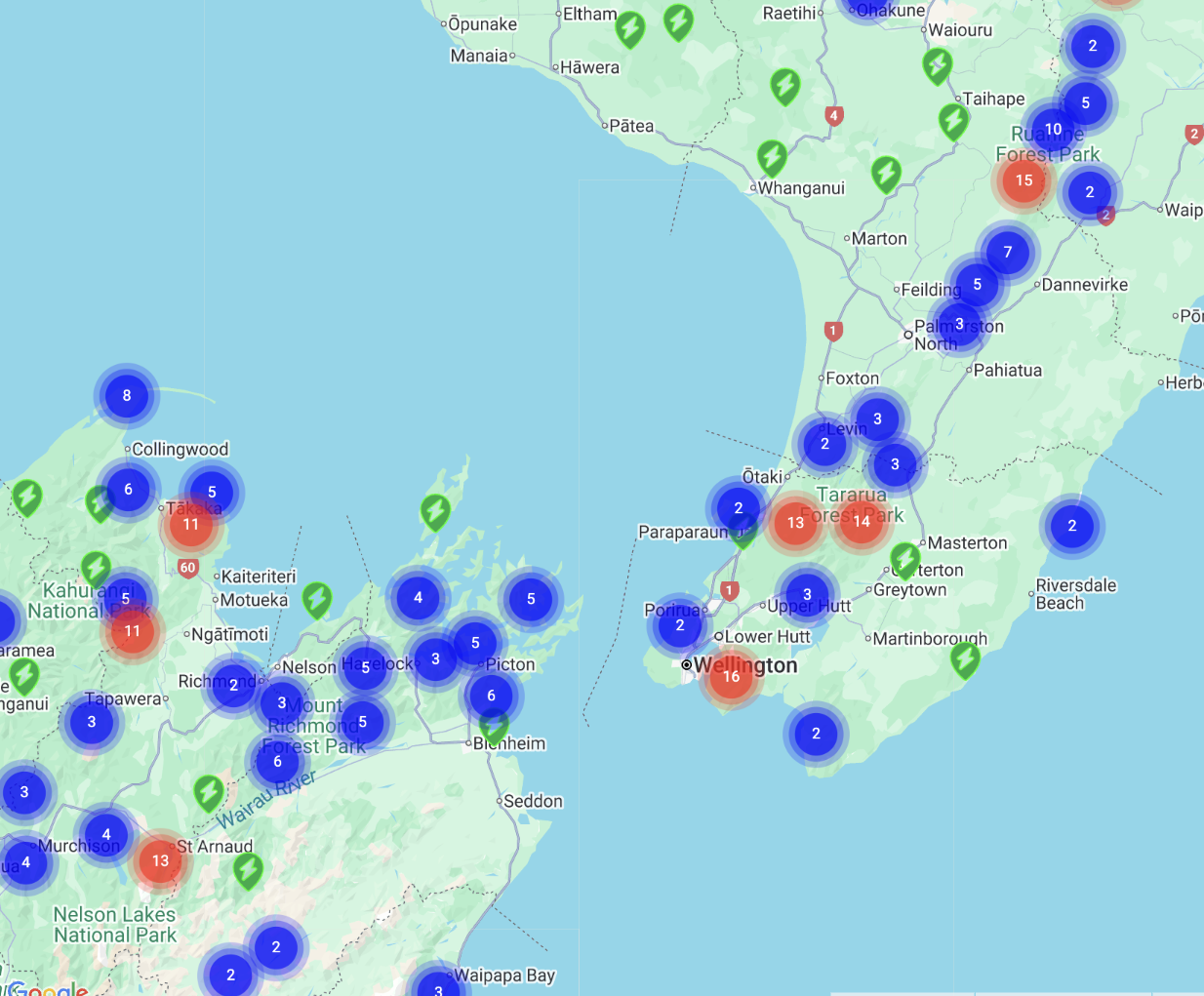
This updated the single markers, but the clustered markers still used Google’s default blue and red circles; to customise their appearance, I needed to define a custom renderer when creating the MarkerClusterer by passing a renderer option and returning a custom AdvancedMarkerElement containing my own SVG, which allowed me to fully control the color, shape, and label of each cluster marker.
new MarkerClusterer({
  map,
  markers,
  renderer: {
    render: ({ count, position }) => {
      const svg = `
        <svg width="40" height="40">
          <circle cx="20" cy="20" r="18" fill="#0dab44" />
          <text x="20" y="25" font-size="14" text-anchor="middle"
        fill="#fff">${count}</text>
        </svg>
      `;
      const div = document.createElement("div");
      div.innerHTML = svg;

      return new google.maps.marker.AdvancedMarkerElement({
        position,
        content: div,
      });
    },
  }
});
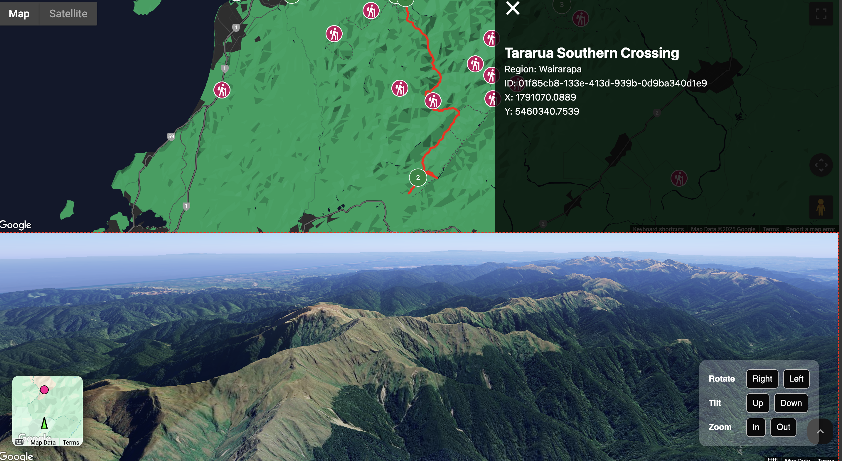
5. Passing data to a Sliding Drawer
23/07/2025
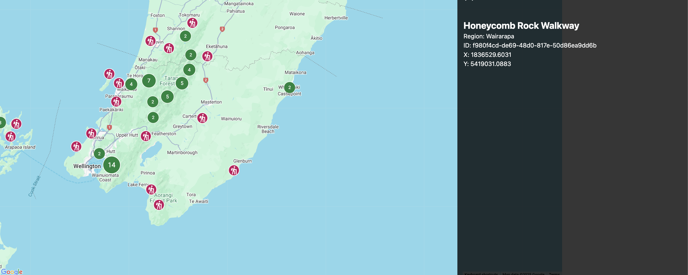
I wanted a way to display more details about each track when clicked. To keep it simple, I added a sliding drawer component that opens from the right hand side when a marker is clicked, reusing a version I made for another map-based app I've been working on.
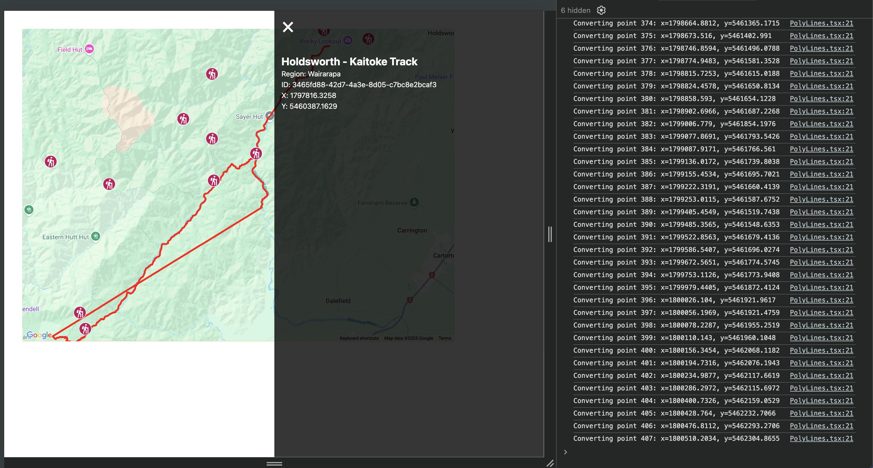
Clicking any single marker now opens the drawer and shows the selected track’s details (name, region, ID, and coordinates). I’m passing the track data to the drawer as props, letting the drawer render content dynamically based on whichever track was clicked.
To handle this, I introduced two pieces of state inside the MainMap component: selectedTrack and drawerOpen. The selectedTrack state is used to store the details of the currently selected track, while drawerOpen manages whether the sliding drawer is visible.
I also updated the ClusteredMarkers component to accept an onMarkerClick callback as a prop. Each time a single marker is clicked, this function is called with the relevant track data. Inside MainMap, this callback sets the selected track and opens the sliding drawer.
The sliding drawer itself now receives the selected track as a prop and renders details about the track, for now being, region, ID, and coordinates.
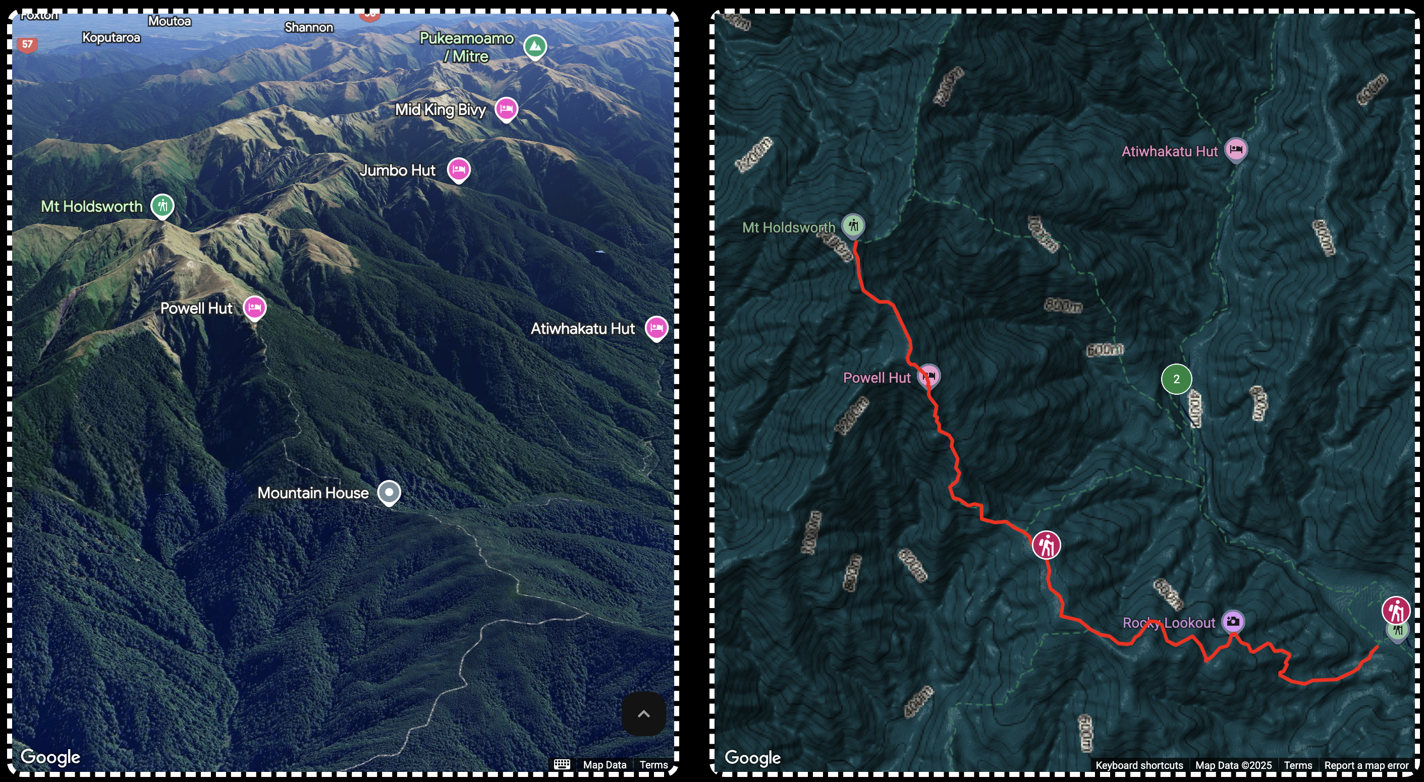
6. Rendering PolyLines
24/07/2025
Once the markers were working and individual track data could be shown in the sliding drawer, the next logical step was to render the actual walking tracks as lines on the map
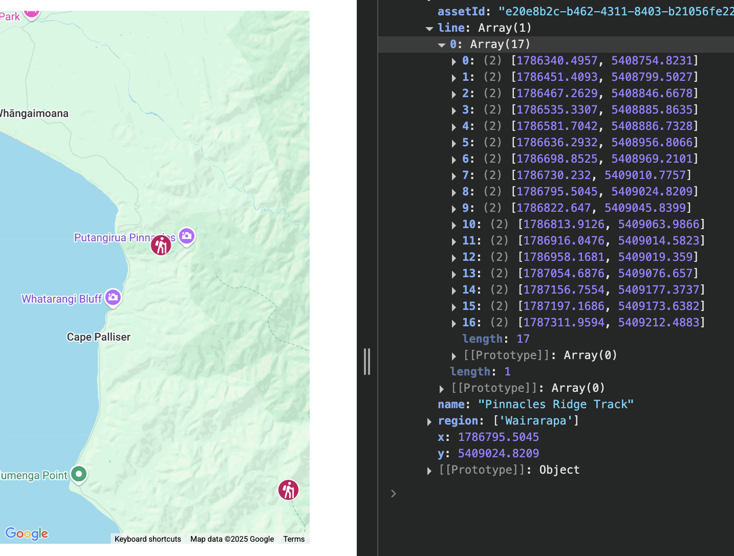
Each DOC track includes a line property, which is an array of [x, y] coordinates in NZTM format. These represent the actual path of the walk, but since they’re not in lat/lng format, they needed to be converted before they could be used with the Google Maps API.
Some of the line arrays were already flat (a single list of points), while others were nested (multiple segments within a track). So the first step was flattening the array if needed. Once flattened, I used the same convertToLatLng() function I’d written earlier to convert each [x, y] point from NZTM to ` lat, lng ` using proj4.
I created a TrackPolyline component that accepts the line array as a prop, flattens it if necessary, maps through the points to convert the coordinates, and then draws a polyline using the native google.maps.Polyline class.
To tie this in with the rest of the app, I updated the MainMap component so that when a marker is clicked, in addition to setting the selected track and opening the sliding drawer, it also conditionally renders a polyline for that track.
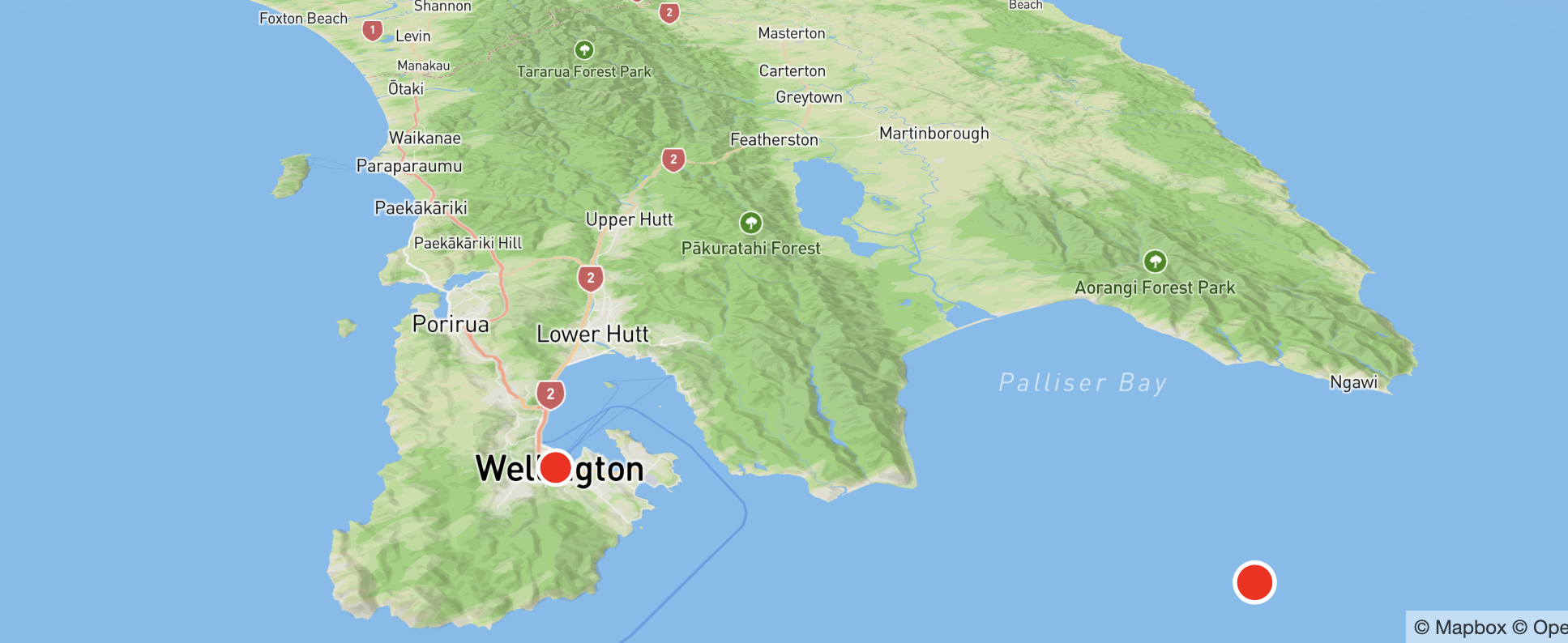
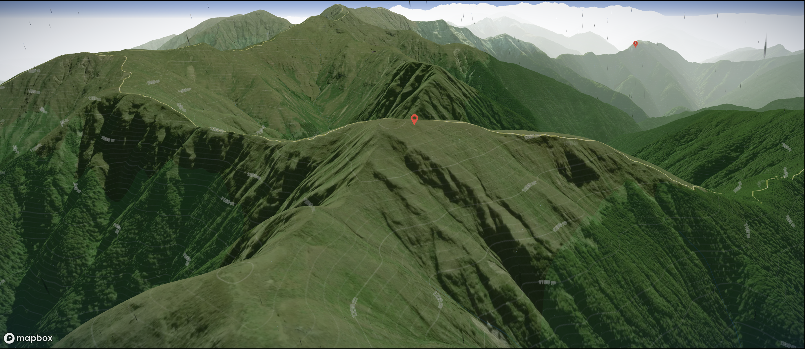
7. Looking at 3D with Google
02/08/2025
Once I had basic markers and polylines working, I started experimenting with 3D map views. I began by directly embedding Google’s new gmp-map-3d web component into my project. It looked great out of the box — full 3D terrain, hybrid satellite imagery, and camera controls using the Option key to rotate. But it didn’t integrate well with my existing setup using @vis.gl/react-google-maps, especially since it lives outside the React tree and doesn’t support clustered markers or interaction events in the same way.
To compare, I temporarily replaced the 3D view with MapLibre GL JS, using LINZ's raster-dem tiles for hillshading and elevation. It worked well for lightweight, open-source terrain and custom tile styling, but the 3D effect wasn’t as immersive — it was more of a shaded relief than actual terrain rendering.
Eventually, I found a temporary middle ground so I could keep exploring: keeping my existing map and track interaction inside the React tree using @vis.gl/react-google-maps, but mounting gmp-map-3d as a separate component beneath it. This way, I could still use Google’s official 3D terrain and satellite layer, while letting my JS map handle clustering, drawer state, and marker selection.
The example code https://visgl.github.io/react-google-maps/examples/map-3d.
I want to sync the state for both maps to keep the views the same and hope to still find a way to render polylines and map markers in the new 3D google maps gmp.
Longer term I would love to look at how heights are calculated for 3D maps, and how to apply layers at the correct heights. So the current setup is a two standalone maps; A 2D map with clustering and interactivity (polylines, narker click), with either terrain or custom styling, as well as a fully rendered 3D satellite view.
The goal; a single 3d Map in topographic style with clustered map markers and polylines (at the correct elevation).
Tools I’ve Tried So Far (and What’s Next)
So far, I’ve used @vis.gl/react-google-maps for building an interactive map in React including marker clustering, custom SVG markers, polylines, and a sliding drawer-based UI. I’ve also embedded gmp-map-3d to experiment with true 3D terrain rendering. While this gave me shows great 3D visuals, it doesn’t yet support clustering or custom overlays. I briefly tested MapLibre GL JS with LINZ raster-dem tiles, which offered more styling freedom and open-source flexibility, but the 3D effect was limited to hillshading. Based on all this, my next steps will likely involve deeper testing with MapTiler and Mapbox GL JS to see if I can get a unified 3D map with full control over elevation-aware polylines and interactive clustering, all in a single integrated view. If those don't pan out, ArcGIS might be the heavier alternative to look into, despite its steeper learning curve.
Tools to Explore
- Google gmp-map-3d A native web component for true 3D terrain and satellite imagery using Google Earth-style rendering.
- @vis.gl/react-google-maps A React wrapper around the Google Maps JavaScript API. Supports interactivity, markers, clustering, and custom styles in 2D maps.
- MapTiler A commercial mapping platform that offers hosted raster and vector tiles (including terrain, topo, satellite). Can be used with MapLibre GL JS.
- MapLibre GL JS An open-source alternative to Mapbox GL JS, used to render customizable vector and raster maps with support for terrain, hillshading, and styling — commonly used with MapTiler, OSM, or LINZ tiles.
- Mapbox GL JS A commercial JavaScript mapping library with advanced support for custom vector maps, styling, and terrain. Requires a Mapbox account.
- ArcGIS JavaScript API A full-featured enterprise mapping/GIS solution with support for 3D terrain, feature layers, analysis, and elevation-based rendering.
- OpenStreetMap (OSM) A community-maintained open dataset of roads, trails, landuse, and other geographic features. Not a renderer — requires a viewer like MapLibre or Leaflet. -
- https://www.linz.govt.nz/products-services/maps/new-zealand-topographic-maps https://www.topomap.co.nz/
Summary of Key Differences
- Google’s gmp-map-3d is the only tool offering photorealistic mesh-based 3D terrain (like Google Earth) but is limited in customization, interactivity, and layering.
- @vis.gl/react-google-maps makes it easy to work with Google Maps in React and supports clustering, polylines, and JSON styling — but only for 2D maps.
- MapTiler provides styled maps (terrain, topo, satellite) and works well with MapLibre if you want open-source rendering with custom tiles.
- MapLibre GL JS gives you full control over styling and layers, works offline, and supports hillshading (not true 3D terrain).
- Mapbox GL JS offers similar power to MapLibre but with official support, better documentation, and extras like 3D terrain — though it requires a paid plan for production use.
- ArcGIS JS API is ideal for advanced spatial analysis, 3D buildings, and terrain rendering with Z-level placement — but it’s heavy and enterprise-focused.
- OpenStreetMap is not a tool itself, but a data source. You’ll need to combine it with a renderer like MapLibre or Leaflet to make it interactive or styled.
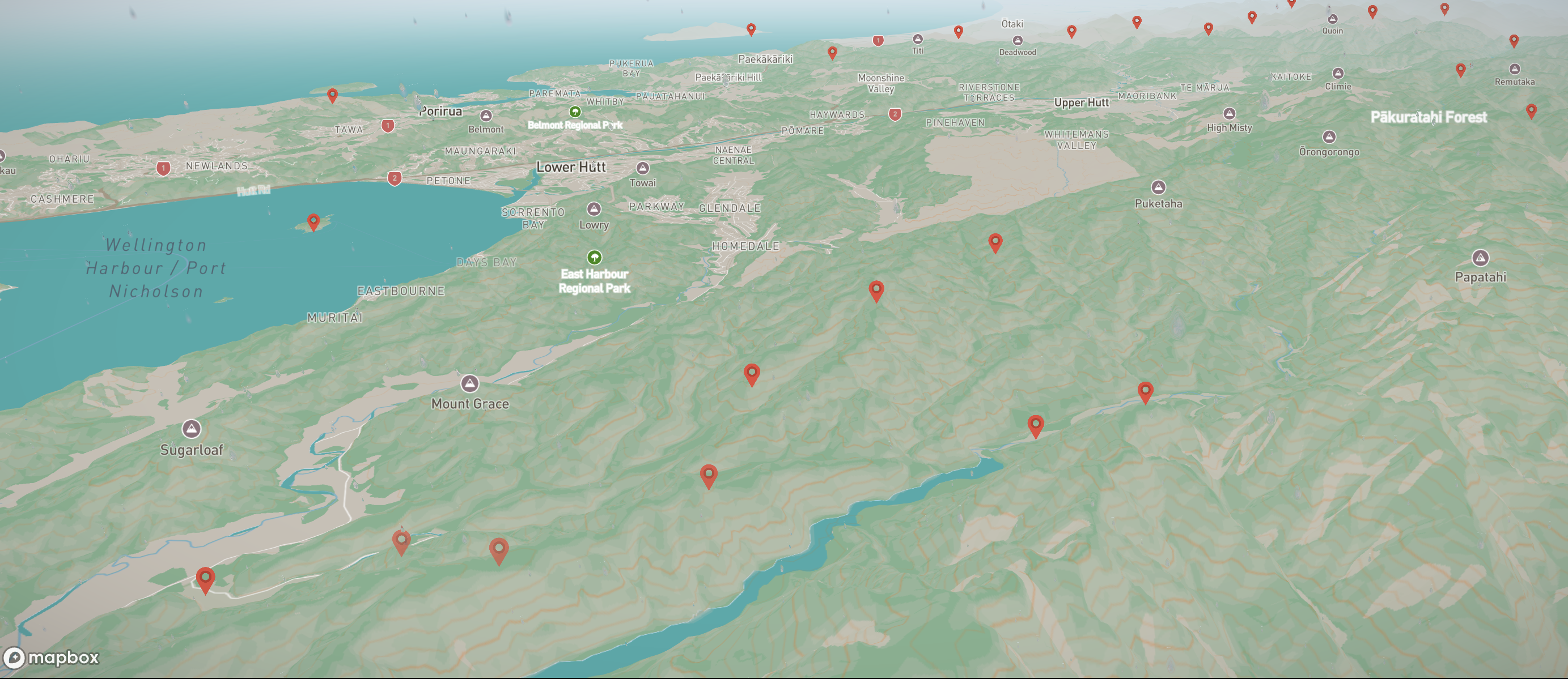
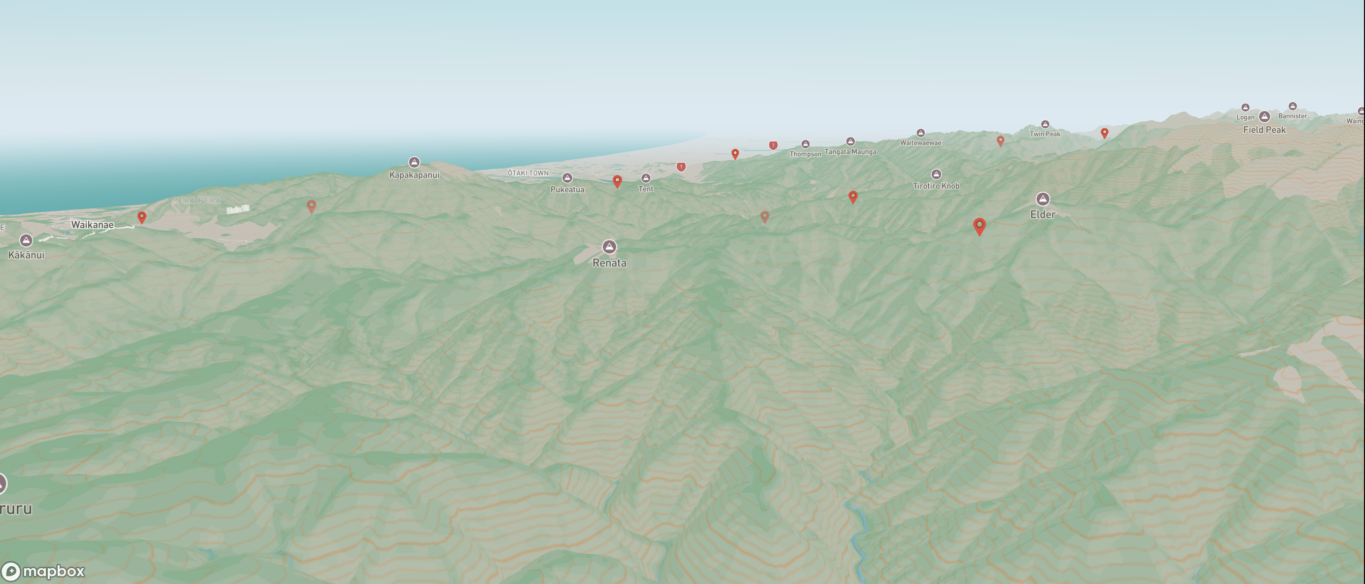
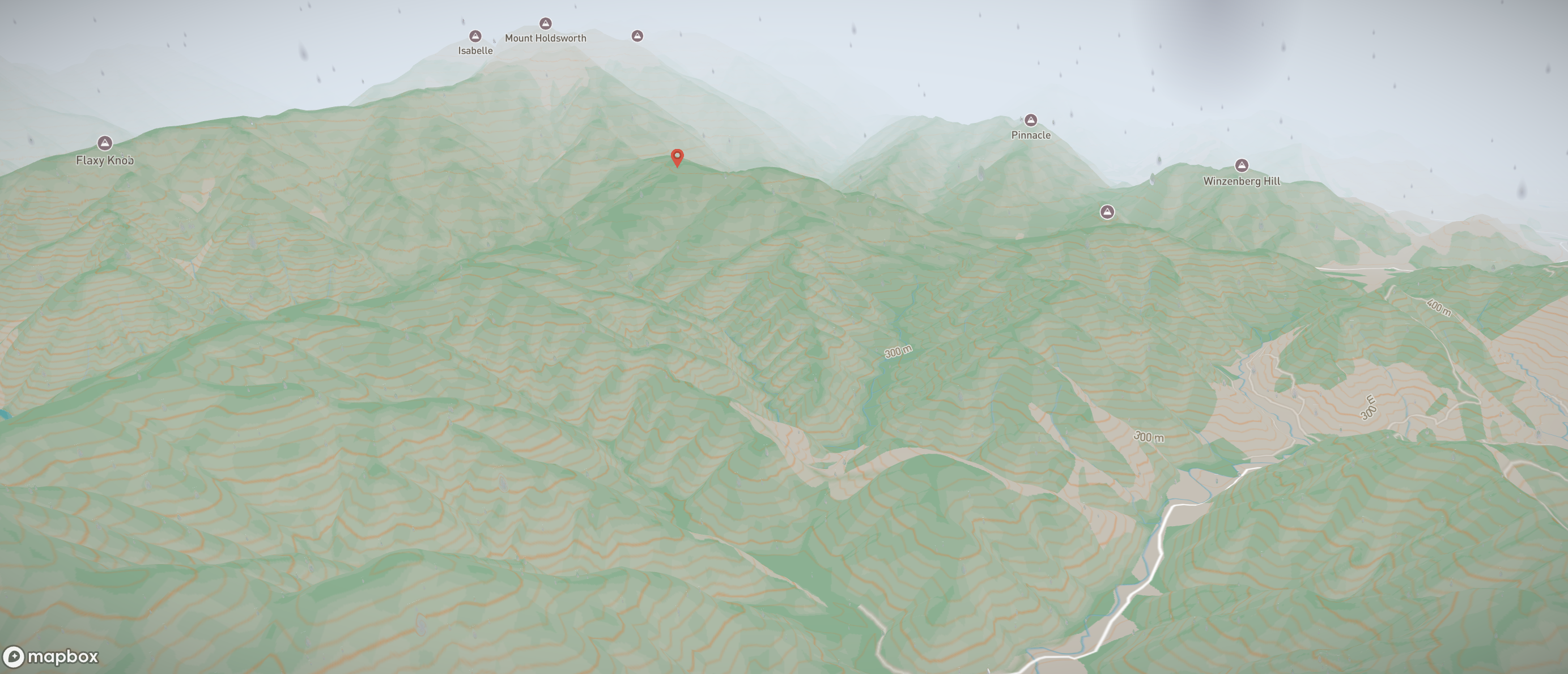
8. Looking at 3D with MapBox
04/08/2025
I've been exploring Mapbox's 3D capabilities and have made significant progress in transitioning from Google Maps to Mapbox GL JS. The move to Mapbox has opened up new possibilities for advanced 3D terrain rendering and custom styling that weren't easily achievable with Google's solution.
For the first test marker, I loaded a dummy point and gave it a different colour and icon size. This was a quick way to confirm that the Mapbox layer setup was correct and that I could replace default symbols with my own styling.
Next, I swapped the simple styled marker for a PNG icon. I loaded the PNG with map.loadImage and added it to the style with map.addImage, then referenced it in the marker layer’s icon-image. This made it easy to test scaling, anchor points, and clarity at different zoom levels
After the single-marker test worked, I moved on to loading the full DOC dataset. I’d found a JSON file containing all DOC tracks, so for testing I dropped it into the frontend’s public folder and loaded it with map.addSourceAfter converting the x/y NZTM coordinates to lat/lng, I built a GeoJSON source for all tracks. Long term, I might move this data to my backend so I can filter and serve only the tracks needed for the current map view, cutting down payload size and speeding up load times. The backend could pull from the DOC API periodically to keep the dataset fresh, or even fetch live from the DOC API when needed—while caching and filtering results to avoid slow loads, large payloads, and API key exposure in the frontend.
With all tracks on the map, I replaced the simple styling with the PNG icon again. This step confirmed the icon stayed crisp at different zoom levels and didn’t cause performance issues when displaying hundreds of points at once.
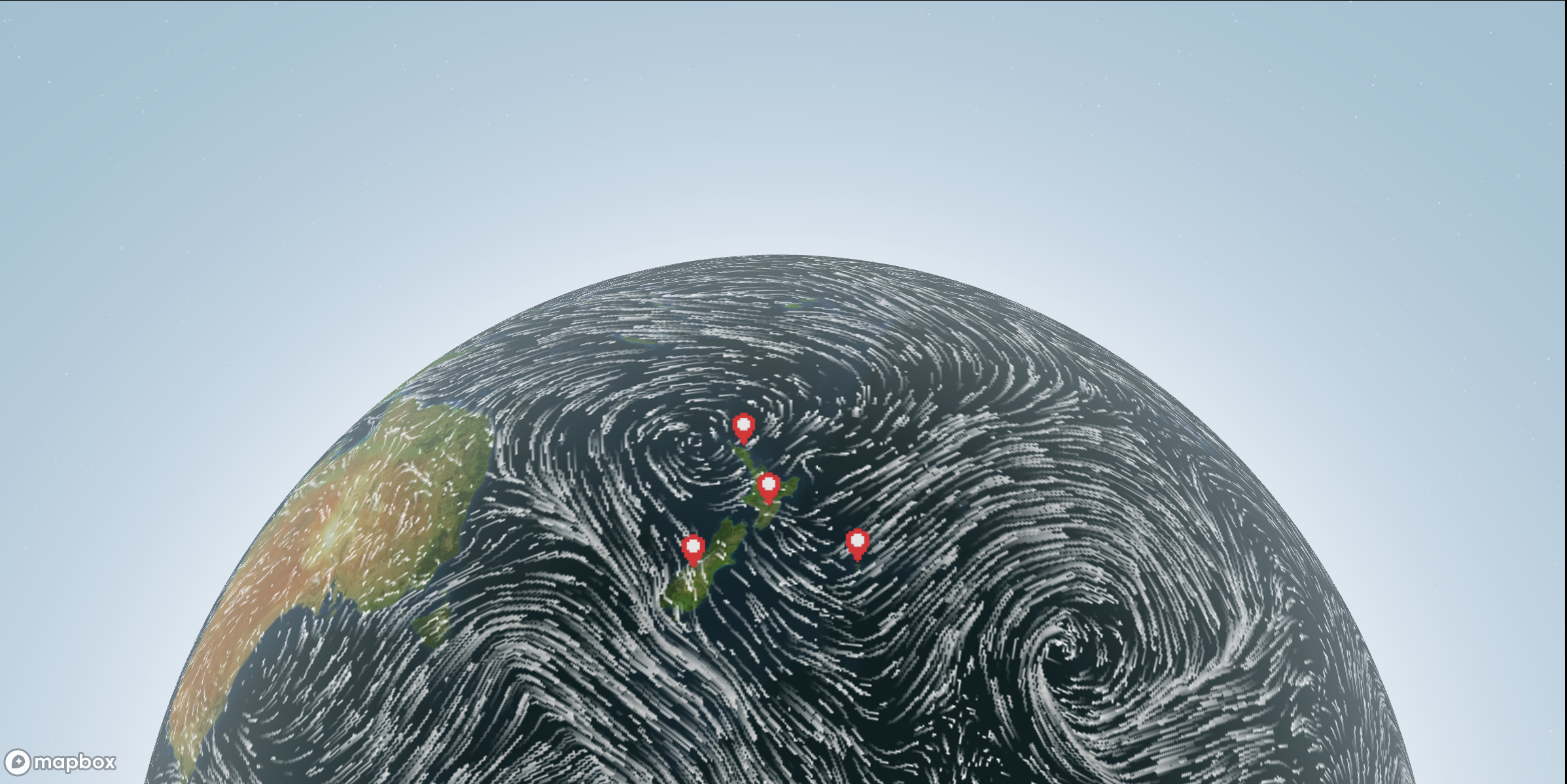
9. Atmosphere and real-time tracking
11/08/2025
I added Mapbox’s sky layer type to simulate atmosphere. The colour changes based on the time of day — lighter blue during daylight and a dark blue at night — and the sun position is fixed for a consistent look. It gives the map a more immersive, 3D feel when pitch is increased.
To test dynamic, real time updates, I added a second source for the International Space Station’s position using the Where the ISS At? API. Every two seconds, the map fetches the latest coordinates, updates the GeoJSON source, and moves the ISS icon. This acted as a quick test of Mapbox’s ability to handle frequent live-data updates, which could be repurposed for tracking a hiker’s location or showing other real-time points on the map, but mostly served as a fun side thought experiment.
10. Custom styling by using paint-property override
13/08/2025
applyLayerStyles is a small helper function I wrote to loop through a list of Mapbox layer IDs and update their paint properties (like fill-color or line-color) after the style loads. On map.load I run applyLayerStyles. This goes through my list of layer IDs and the paint property I want to change for each one (like fill-color or line-color). For every layer, it calls setPaintProperty to update the colour or style — but only if that layer is present in the current Mapbox style. If a layer isn’t there, it just skips it, so the map doesn’t throw errors.
## Time based sky - day / night The sky layer’s colour and sun intensity are set by checking the current hour. Before 6 am or after 6 pm, the atmosphere is darker with a dimmer sun; between those times, it’s a bright sky with higher sun intensity. This makes the map’s mood shift automatically over the day.
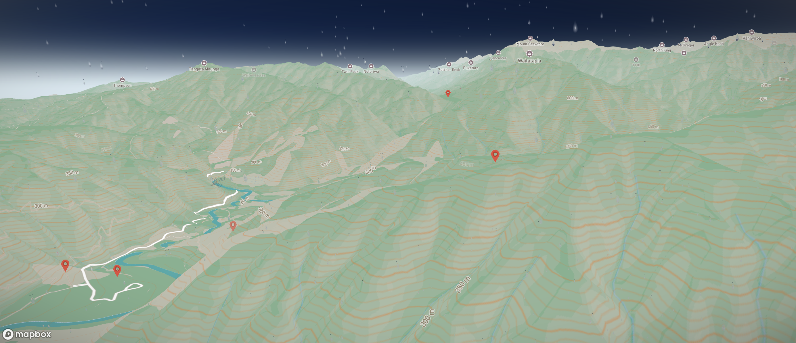
## Fog / cloud I experimented with Mapbox’s setFog API to add haze and atmospheric colour blending to the horizon. This can make distant terrain feel more realistic, especially in a pitched 3D view, but I kept it subtle so it wouldn’t overpower the map detail.
## Styles set and imported from Mapbox Studio swapped from my coded paint-property overrides to using a custom style I built in Mapbox Studio, I no longer needed applyLayerStyles. Instead, I just passed the style’s URL from Studio straight into the style option when creating the map. I combined multiple layers by adding the satellite imagery style at lower opacity over the terrain-enabled outdoors style. This creates a hybrid look, realistic imagery for context, but with topographic detail and hillshading still visible from the outdoors style.
11. Alternate ways to render markers
15/08/2025
I tested two different approaches to adding markers. Both work, but they behave quite differently under the hood. The first approach was using Mapbox’s built-in Marker() class:
new mapboxgl.Marker().setLngLat([30.5, 50.5]).addTo(mapRef.current!);
This creates a real DOM element that sits on top of the map canvas and moves around as the map pans and zooms. It’s quick to get going, and you can style it with CSS or add normal DOM event listeners. That makes it perfect for a handful of “special” markers (for example, showing the ISS location or a “you are here” pin).
The downside is performance: each marker is a live DOM node. A few are fine, but once you get into hundreds or thousands, things start to lag. They also don’t integrate with Mapbox’s data-driven styling or clustering, since they aren’t part of the WebGL render pipeline.
The second approach, and the one I kept, is to render markers as a symbol layer from a GeoJSON source:
Here the markers are drawn directly by Mapbox’s WebGL renderer. This means they scale to thousands of points without slowing down, and they automatically work with pitch, rotation, clustering, filters, and expressions. Interaction is still possible via map.on("click", "marker-point", …), even though there aren’t any DOM elements to attach listeners to.
In the end, I stuck with the GeoJSON + symbol layer method for the bulk of my track markers. It’s more scalable and ties in with features I’ll need later like clustering and data-driven styling.
12. Mapbox GL JS Wind overlay (GFS particles)
16/08/2025
I wanted to try something a bit more experimental and came across Mapbox’s raster-particle example. This uses a raster-array source with u/v wind components and renders them as animated particles that flow across the map. It gives the effect of live wind fields moving over the basemap. I set up the source and then added the particle layer:
The speed, fade, and reset factors let me control how “streaky” or smooth the animation feels, while raster-particle-count sets how dense the flow is. I kept the colour ramp simple (white → black) so it stood out clearly against my custom map style.
Because this is a native Mapbox GL layer, it renders as part of the WebGL pipeline and stays smooth even when rotating or pitching the map. It’s not interactive like my track markers, but it adds some nice motion and atmosphere to the background.
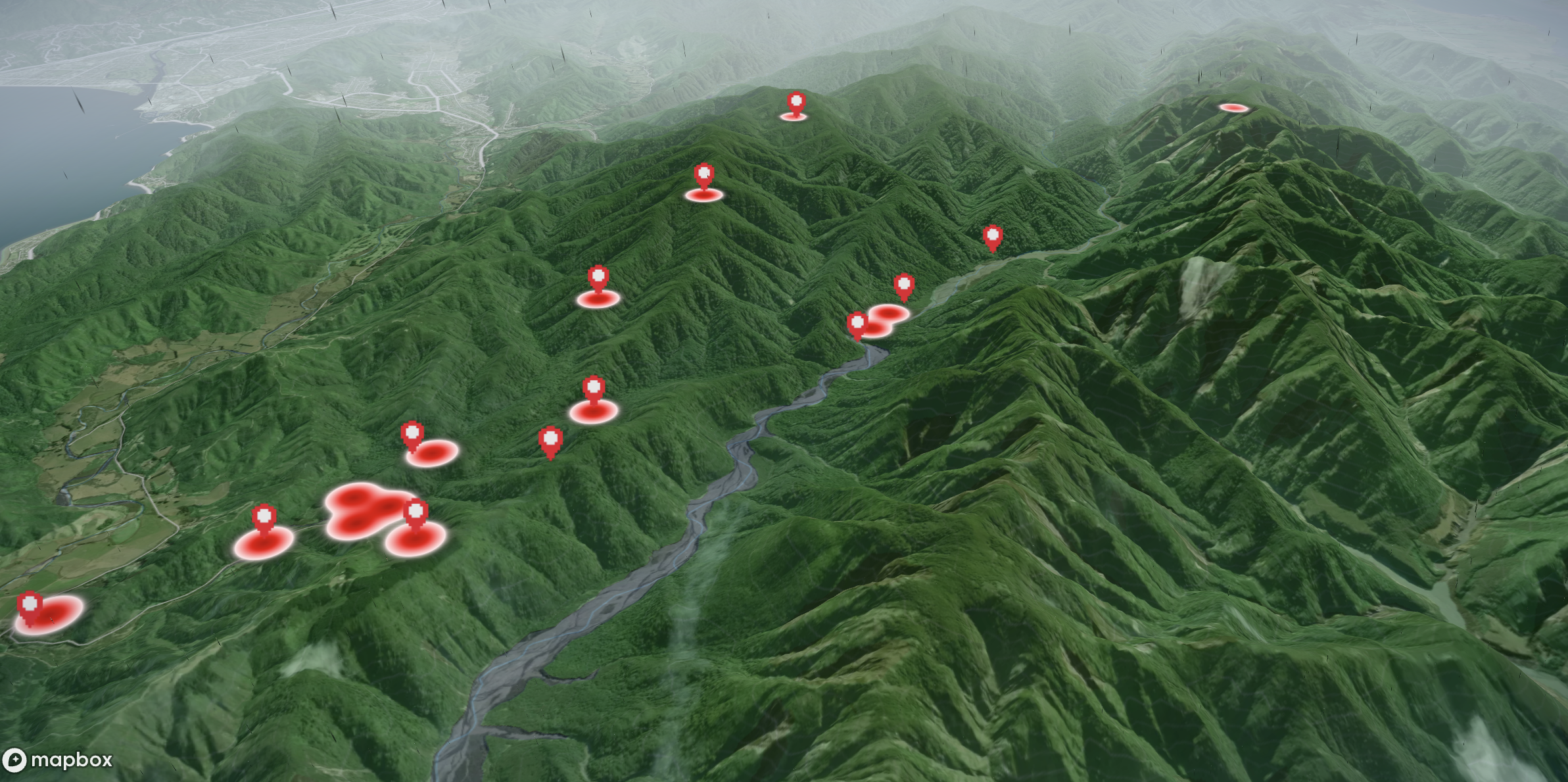
13. Heatmap
23/08/2025
Instead of showing each track as a discrete marker, the heatmap aggregates them into a density surface, highlighting areas with more tracks at a glance.
Why a Heatmap? Markers are great for interactivity — you can click them, open a drawer, or draw a polyline — but once you zoom out, the sheer number of markers becomes overwhelming. Even clustering only gets me so far, since it still renders every point in some form. A heatmap, on the other hand, lets me see where activity is concentrated without worrying about clutter.
Like before, the DOC track data comes in NZTM (EPSG:2193). To use it with Mapbox, I had to convert each track’s representative coordinate (midpoint of its line, or fallback to its x/y if no line was present) into WGS84 lat/lng. I reused proj4 for this conversion.
const toLonLat = (xy: [number, number]) =>proj4("EPSG:2193", "WGS84", xy) as [number, number];Each converted track point then got merged with any duplicates, with a weight property added to indicate how many tracks share the same location.
I wrapped the logic inside a HeatmapAddon React component. It takes the map instance and track data as props, builds the GeoJSON, and adds a heatmap layer on top of the map.
The colour ramp goes from pale green at low density to deep forest green where track density is highest. Radius and opacity scale with zoom so the heatmap fades as you zoom closer, eventually revealing the individual markers and polylines.
The biggest change in my main MapBox.tsx file was simply rendering the HeatmapAddon component once the map had loaded
This way, the heatmap layers slot neatly into the existing pipeline — sitting beneath markers, polylines, and the sky/fog layers I’ve already set up.
The result is a much cleaner overview when zoomed out. Instead of hundreds of overlapping markers, I get a smooth, glowing surface that makes it immediately obvious which areas of New Zealand have the most DOC tracks. Zooming in still brings back the individual markers and polylines for interaction.
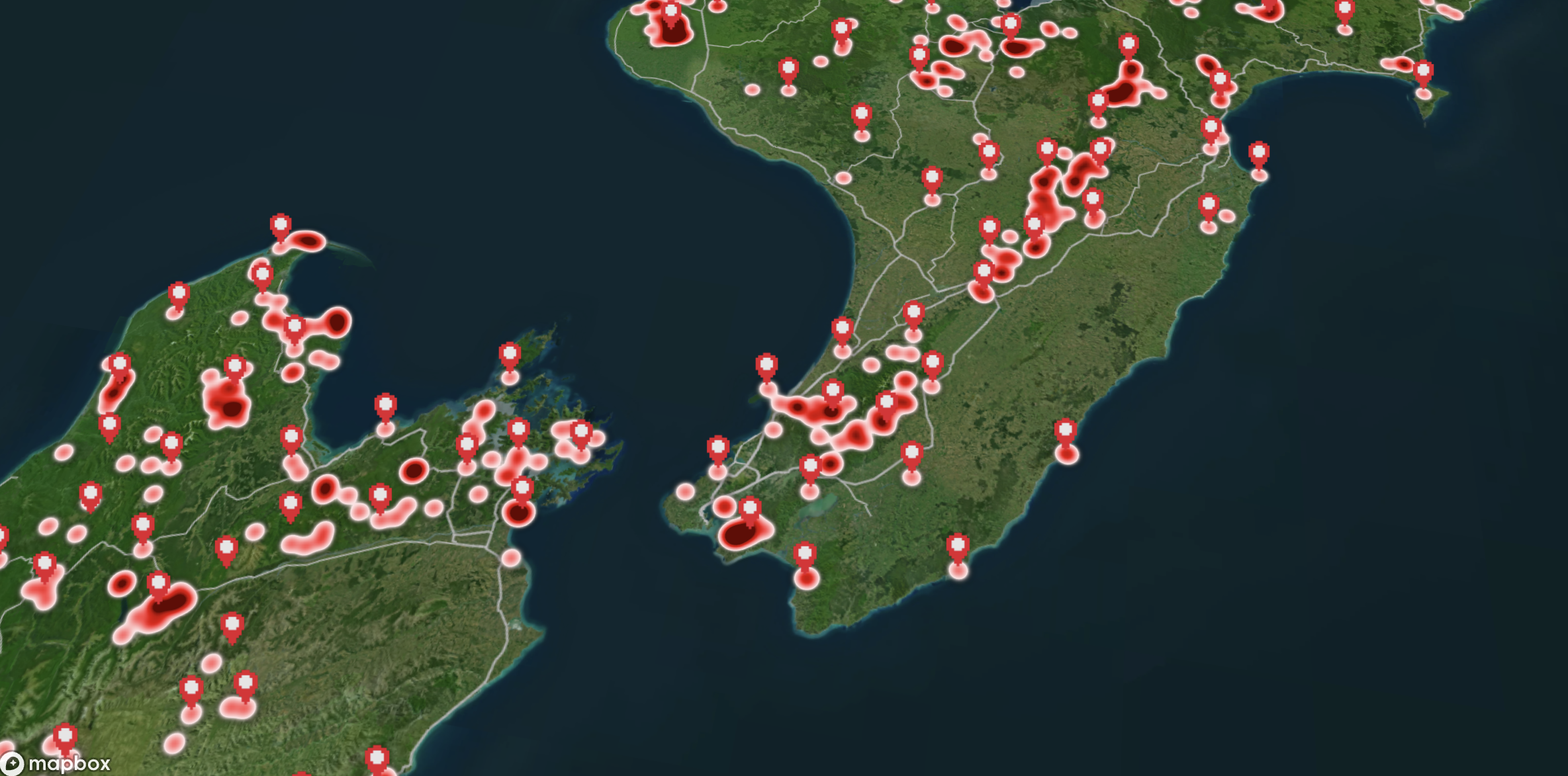
Clustering vs Heatmaps
Both clustering and heatmaps solve the same problem: too many points on screen at once. Clustering groups markers into bubbles you can click and expand, which keeps interactivity but can still feel busy. Heatmaps, on the other hand, drop the individual markers and instead show a continuous surface of density.
The trade-off is losing per-point clicks at low zoom levels, but you gain a much clearer sense of _where_ tracks are concentrated.
In practice, I see them as complementary — clustering is best when I want to keep interaction with individual tracks at mid zooms, while the heatmap is better for giving a bird’s-eye view of overall activity across the whole country.